Wednesday 28 September 2011

Details


This is the conference room area (the furniture has been discussed in the previous post). As visible in this snapshot, there are 2 red doors leading to male and female bathrooms at the end of the building. One more aspect that is shown beautifully in this snapshot is the strip of glass above the wooden siding beneath the concrete ceiling - this aspect is a vehicle to transport sunlight into the building, which is essential for a working environment and also enhancing its warmth.


This shot shows the entrance of the building from the exterior. This door (and all the other doors) are scripted so that when they are touched, they will slide upwards to allow us to enter the building, and later slide back down after 5 seconds. This snapshot once again shows the layer of glass above the siding that functions similarly to a skylight. 


Once again, I decided to make my own texture for the doors in photoshop. I wanted a simple texture with a strong colour that constrasts the wood, concrete and glass of the building. I decided on 2 soft red shades very similar to each other and simply made a gradient - being a very warm, soft and inviting as well as intimate texture. 


I also applied the red texture to the elevator I had constructed in the middle of part 2 of the building (workspace) that transports partners to the roof. Another feature visible in this snapshot are the tables in the working space. I wanted a raw, rather than box type look for them, therefore slightly tapered and distorted the original cuboid shapes to make irregular shapes out of glass (with smooth edges of course). Each table is supported by a wooden collumn that contrasts with the modernity of the glass. These tables are situated so that the partners will be able to look out of the windows whenever they are working, and have direct sunlight whenever possible. 


This snapshot shows my sculptie which I had decided to keep in my building. I traded a scultie with archit and april but their ones didnt suit the theme of my building, therefore I decided to use my own sculptie. I have made a script for the sculptie which says "Sursum" (Reach for the heights) forever. This is to motivate the partners and clients to strive for as much perfection as they can in their work, The sharp corners pointing upwards also reinforves this message of striving for the highest form of success.  

Final Design


Final building (back)


Final building (front)


This is the view from the corridor that people in the building will have to go through to enter the main areas. It is quite narrow, allowing opportunities for intimate situations between people. 


This is the view of the interior from part 1 (conference room). The partition is visible here as well as the small step leading to part 2 (working space). There is also a door visible here. This is the back door of the building leading to a narrow alleyway between this building and the residential building next to it.  The difference in heights of both parts of the building is obvious here. It can be seen that part 2 has a lower ceiling and higher floor, being a comparatively close space - more intimate for partners. The step up is also visible here, emphasising this point.


This is the view of the interior from part 2 (working area), where part 1 is visible with the conference room table and an interesting type of seating for meetings. This seating block is shared by all participants of meeting, making the experience more warm, informal and intimate as people will be seated closer to each other.


This is the roof of the building which also serves as an informal relaxation area for partners to wind down after a hard day of work, to eat their lunch etc. while overlooking the surrounding area. The furniture is similar to that of the conference room - one shared seating block and rounded table convenient for discussion etc. This space signifies the importance of warmth, friendship and intimacy between partners/friends who work each other to be able to gain success. If they are comfortable with each other, work will not be so much of a chore but rather an enjoyable experience. 

Further steps

I developed my design further with inspiration largely from my precedent building (Carpenter's Centre by Le Corbusier), my previous projects' themes (warmth and intimacy) as well as the context of my site.


I decided that the layout of my building would be in 2 parts:
1. the conference room for the partners to have meetings with their clients. (including the bathrooms and entrance corridor)
2. The working space of the 5 spaces (including an elevator that transports workers to the roof which is also used as a terrace/balcony). 

I have made these 2 spaces slightly divided by a glass semi partition with a strip of wood so that the partners have some privacy from the conference room when they are not needed for a meeting. But in saying this, this partition is not as solid or definite, warmly welcoming clients to the business and gifting them the chance to observe how the business operates, creating a new close and intimate relationship between the clients and partners. 

The roof above the 1st part is slightly more elevated than the roof of the 2nd part. The 2nd part of the office has a lower ceiling and higher floor than the 1st part with a small step linking these areas. These aspects are visible to viewers on the outside through the ceiling exceeding the boundaries created by the siding of my building. This makes the building more inviting and exudes more warmth rather than if the roof and the siding fully blocked each other out. Furthermore, the uneven layered look of the different ceiling and floor heights corresponds with the layered look of the Carpenter Centre by Le Corbusier. 


The siding of my building consists of a top (glass) and bottom (wood) parts

For the wooden look for the siding of my building, instead of selecting one of the default textures, I decided to make my own texture on photoshop using wood-like colours - brown and beige. 


Rethinking building design

I decided to make my building now one level instead of similar to my building of 3 levels. This will make  the collaboration between the partners more convenient as stairs and elevators will not obstruct the links between the spaces in the offices.


I have used fluorescent colours to make building easier.


Since it is now one level, I decided to increase the floor area to make up for the lost space. Otherwise, my building still fits on my original site, except it now covers more of the car park. 


Sunday 25 September 2011

Building Framework

I started to construct the main basic structure of my building as I had developed it in the animation workshop - with 3 levels for an architect, engineer, photographer, chef and accountant.


But after showing it to our tutors, I realised that all along, I had been working with the building as separate offices/spaces for each partner working separately on their own projects and clients, whereas we were required to increase their collaboration in a way that all of them would work on each project. for this to occur, I decided that I needed to change some of my partners' occupations for them to be able to work together as one business rather than 5 small businesses. 

I came up with 4 other partners (some of my previous partners stayed):
>Engineer
>Accountant
>Landscape Architect
>Interior Designer

And in order to allow more communication and collaboration between them, I decided to make my office building only one level rather than my original 3 levels. 

DIGITAL/REACTIVE ARCHITECTURE WORKSHOP - First day

On our first day of this workshop, we were shown the 3D scanner by our tutors and were required to make a fixture for the building in 3DS Max. I decided to make a prim that would act as a fixture to control windows and how much they are opened. But when I used the prim composer, m original shape became quite distorted and appeared as a sculpture with sharp edges, possibly able to be used as a decoration feature in my design. 


Monday 19 September 2011

Matrix for presentation


Overall photo of matrix


Top Left corner


Bottom Left corner


Top Right corner


Bottom right corner

Wednesday 14 September 2011

Animation Video and Link

Here is my final Animation:


I made it using Windows Live Music Maker. I added some back ground instrumental music - it is called Morning Bliss and includes Indian drums (tabla) and flute. I chose this track as the beat was fast and exciting, which suits the fast changing of photos and development. It also has a very happy mood:-D

Youtube Link:

http://www.youtube.com/watch?v=WwV5qC-RfrM

(Please note: the clarity of the video uploaded on youtube is better than the one uploaded here)

Finished sheet!


This is my finished A1 sheet:-D I feel that I am satisfied with how it has turned out and my final design. 

STAGE EIGHT


I decided that I wanted to have a signboard at some place on the facade of the building and studied the traffic flows of the roads to find that the most traffic viewed the south-west corner/part f the building due to the meeting of Beach Road and Mahuhu Crescent. 


More specifically, I decided to place the signboard on the bottom facade as the photographer would need to curtain off the walls most of the time anyway in order to control the light in photographs etc.


I then sketched the final building design in context of its surroundings - the surrounding buildings, carpark and roads etc. I decided that I liked the way it has turned out:-D

STAGE SEVEN


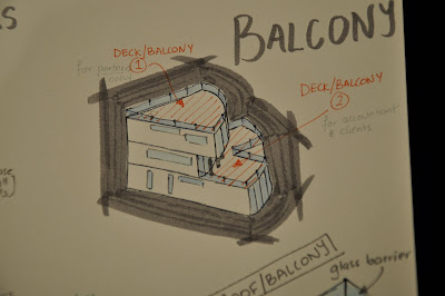
This was my modified 3D drawing of the exterior of the building. I decided to make the empty outdoor surface above the ground level into another outdoor area to make the most of the space and to provide another place for relaxation, especially for the accountant and visiting clients. 


I added a staircase near the back (carpark) entrance of the building which could be used in case of a fire in the building. The above photo also shows the detail in the elevator and its 3 parts - the person transporter, the material transporter and the glass ground with holes for informal communication.


This photo shows the basic ideas in terms of structure in my buildings and the collumns on the corners so that they do not disturb the design too much as well as the beams in the ceilings/floors and collumns in the walls.


This photo shows a close up sketch of the balcony railings (for both balconies). It is made of a tetal structure and glass barriers.

STAGE SIX


After moving the Engineer upstairs with the Architect, my original shape changed slightly so that the 2nd level was smaller in size than the 3rd level and the Accountant did not need as much space as the Architect and Engineer combined did. 


This was a rough drawing of the new shape of the building in isometric.


I started to draw each floor in axonometric to show how the interior would be like, corresponding to the floor plans made earlier with small modifications. I started with the 3rd floor (the drawing on the top of this photo was the final one).


This was the ground and 2nd level showed in axonometric too. It shows the link (elevator-like) between the kitchen (chef) and the accountant's office. 

STAGE FIVE

When meeting with my tutors on Monday, they reminded me that my building should be more open plan with more chance of collaboration and more connection between the partners for this reason. Therefore, I went home and started to rethink my ideas and connections.

I figured out that there were 3 mutual relationships between my partners:

>Engineer & Architect (A can design the building,and during the process ask E for structural and technical advice whereas E can clarify any part of the design with A at any time).

>Accountant & Chef (C provide meals for A and A prepare financial statements for C)

> Photographer & Chef (C provide food for P and P take photos of food forC to promote cafe)


^I also tried to outline how muchspace was needed by each partner in relation to the others. P and C wuld eed the most space, followed by the Arch and then the E and Acc.


^This was another attempt of mine to design the floor plan in more detail and to suit these new requirements too.

STAGE FOUR

I decided to draw more detailed foor plans for each level and started to consider the resources and equipment each person would require in their space. I also started to think about connections between the 3 levels in form of a staircase.


As it was one of our requirements, I decided to figure out what resources were mostly needed by the partners and where it was provided in terms of distance to the building. I decided that the Architect needed access to Gordon Harris for stationary which was 10 minutes away, the Chef needed a supermarket and Countdown (previously Foodtown) was just 3 minutes away. And also, the photographer may need camera supplies and framing services quite regularly which could be satisfied by Camera & Camera on Queen St (8 minutes away)

STAGE THREE

The next step was to figure out the 3D aspect of the building's shape. 


My step-by-step process of changing different shapes. Please note that I decided to make the building 3 storeys instead of 2 as I wanted the architect to be able to have their own floor which is higher up, allowing them to view more of their surroundings for inspiration.


I finally decided on this 3-step, layered elevation which was somewhat inspired by the building I was given by Le Corbusier - Carpenter Centre as the elevation of this building also has many irregular layers.

STAGE TWO

I felt that it was now time to start planning the floor plan of the building - including factors such as the overall shape and the arrangement of the 5 partners on different levels where necessary.


I decided that since the chef will be running a cafe and the photographer a studio, therefore they will need the most public access than the other partners. This is why I decided to put them on the ground floor. Secondly, they will need more space than the Engineer, Architect and Accountant, who will be able to fit in a smaller space. 

Floor Plan shapes:


I thought of a pentagon shape as it has 5 sides/edges, and there are 5 partners in theis business, therefore the building will be able to reflect the partners well. 


This shape was conceived when I tried to put the 2 most convenient shapes of the space needed by the photographer and chef, who will be situated on the bottom floor.


This concept was thought of when I sketched the basic shape of the site and found that this quarter-circle shape best utilises the shape on site. It is also the point closest to the road, able to attract customers to the business.